Designing for Kids | Crafting the Perfect Website Experience

Designing the Perfect Website For Kids: What You Need to Know

It’s no big secret – all kids love the internet. The problem is, however, their physical and cognitive limitations provide a lot of challenges when they are online. And, it can be hard to find a website that caters to their needs in an appropriate way.

These pint-sized people are not interested in reading tons of information – they want to have fun and maybe to learn. So, instead of a restrained color palette or a site that focuses on functionality, the goal of the developer/designer is to go bold, go bright, go big, or go home.

Hungry for more juicy tidbits? Keep reading to learn more about designing the perfect website for kids.

Design for kids of different ages
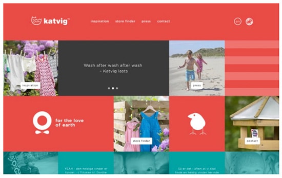
kids-website-design Unlike adults, kids don’t have fully developed brains or physical skills. Thus, when creating a site that will capture and keep their attention, all the traditional rules of website design must be thrown out the window.

For instance, data suggests that children are very aware of age differences and therefore won’t engage with something that they consider to be for babies or “old people.” Thus, it is important that your site is age appropriate for the specific age group being targeted.

To meet this sweet spot, the following points must be considered:

Designing for children 3 to 5

Kids in this age range have already developed a sense of self but, they are not equipped with the mental models that adults have built throughout the years. They do, however, have rough motor skills and know how to tap and swipe on a touch screen.

Websites designed for this particular age group should be filled with bright sounds and colors. These two elements will capture their imagination, as will nature themes (due to their familiarity) and cute characters. Also, because they haven’t developed their reading skills yet, the text on this site should be limited and kept to single, simple words.

Designing for children ages 6 to 8
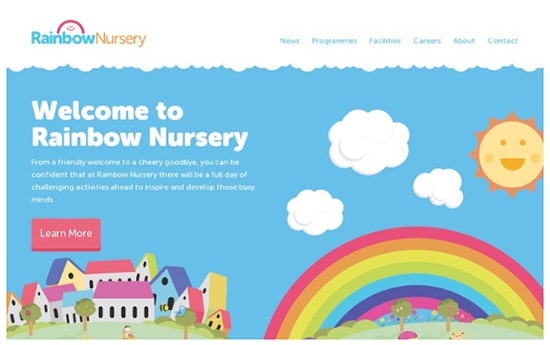
kids-website-design-2 It is around this age that the frontal lobes have started to develop and mature, which means that the kids in this group are beginning to develop empathy and are able to concentrate for longer periods of time – although girls are able to do this sooner than boys.

Furthermore, even though most of them can use a pair of scissors with some skill, their fine motor skills have yet to develop. An important fact indeed when you realize that this affects the way that they physically interact with an interface.

Children in this age group like things that are a little more challenging. They also love that they’re getting older and thus have upgraded past the websites for younger kids.

The colors on this site should still be bright but they should also have more depth i.e. images and graphics should be more layered or dense and characters more human-like. Also, the typography must be simple and easy to read, albeit with a few more words than the website for the younger kids.

Designing for children ages 9 to 12

kids-website-design-3 Kids in this age group have either fully developed their fine motor skills or will shortly. In other words, they have all the physical skills they need to use a mouse and keyboard. But, unlike adults, they have not developed the ability to think in an abstract way. This ability gives an individual the ability to not only predict the consequences of their actions but to reflect on them as well.

Consider this – let’s say a 10-year-old is waiting for a game to load on a gaming site. All of a sudden, an interesting-looking ad pops up and he or she clicks on it. This takes them to a new website, which annoys them because their original goal was delayed.

What the child doesn’t know is how much damage this simple action can do to the computer. Plus, the next time they want to download something they’ll probably make the same mistake again – until all the malware they’ve accidentally downloaded forces the parent to take it in for repair.

When the computer is back from the shop, the child will probably do the same thing again because their brain is not able to fully realize the consequences of their actions. They may have a suspicion that clicking on the ad will prevent them from reaching their goal, but they don’t fully understand how much money and time will be spent to fix the computer or how much data the nefarious hacker will be able to access before the malware is removed.

Children that are in this age group are getting more proficient at using the internet and want to visit a website that makes them feel older and more grown-up. The typography should remain simple and full of color but word structure should be more traditional and the palettes should be more complex.

It’s Also Important to Note…

While catering to specific age groups is important, there are numerous other factors to consider when designing websites for children. For instance, kids can be easily influenced and thus, we must do everything we can to maintain age appropriate standards. Other considerations include:

kids-website-design-4 Create a happy website. When children visit your website, not only should the colors be happy and bright, the overall mood of your website should be as well. Cheerful characters, smiling faces, positive words, and energetic gestures will help contribute to this type of atmosphere.

Use familiar elements. Recognizable shapes appeal to children (especially those of a younger age) because they reinforce and encourage the learning process. For instance, animals and objects found around the home are all identifiable and familiar to them because these things make up much of their tactile and visual world.

Create a world filled with visual depth. Doing so makes the on-screen world both feel and look more real, which is particularly important as kids get older. To achieve this effect, you can use gradients, shadow, three dimensions, etc. to create a more realistic vision.

Use a storyline to create interest. A storyline will not only help create a connection between the website and the child, it will also keep him or her engaged. Consider using the story as the focus of your website design, including the characters, setting, and interactive elements of the site.

Use interactive features to educate and entertain. Activities, games, and videos, are all excellent tools that can be used to enrich arithmetic, reading, and listening. And, when you incorporate rewards (bonus points, special prizes, etc.) you will find that it encourages their continued progress. Printable activities, like coloring pages, are also a good idea and help to improve imagination, coordination, and creativity.

Maintain transparency with the parents. Let’s face it – there a lot of weirdos on the internet and, understandably, this causes parents to have some apprehension when their kids are online. Thus, it is important to make parents feel confident that your website is age appropriate, secure, and safe. To this end, create a section for parents that outlines the purpose of your site as well as any other information they may need and/or want.

kids-website-design-5 Substitute buttons for text links. Most kids under the age of 10 are used to playing with tablets and thus are familiar with using buttons to navigate. Plus, since their fine motor skills haven’t fully developed, these kids will need larger trigger points than older kids.

Use the on-demand concept to relay information. Most younger kids love instant gratification and don’t have the patience to wait for instructions to load, which will result in them losing interest and possibly leaving your site. Circumvent this issue with on-demand instructions – possibly through voiceover support for those who aren’t able to read yet. Older kids, however, will respond better to after-failure messages. In this way, they won’t be discouraged if they make mistakes.

Test, test, and test again. Although testing your product (whether physical or digital) is essential, it gains even more importance when talking in terms of a website for children. For instance, kids are not known for their listening skills, a shortcoming that must be taken into consideration as it can affect the success of your site.

Any advertising is age appropriate. It’s important to note that children, especially the younger ones, are not able to distinguish between real content and advertisements and promotions. As a result, many designers/developers/site owners forego this option. If you decide to go down this route, however, make sure to consider the purpose of your site and whether your ads would be appropriate in this type of setting.

In conclusion

When designing a website for kids, it’s time to break outside the box and let your creative muse loose e.g. an unstructured layout that incorporates a variety of focal points is a great idea. In other words, throw away most of the traditional rules that come into play when building sites geared towards adults. Still, it’s important to remember that this endeavor comes with its own set of guidelines – like ensuring your site is bold, bright, and big – to both entertain and encourage engagement. Basically, your goal is to give children a lot of stuff to look at to keep both their brains and eyes busy.

blogs

Designing the Perfect Website For Kids: What You Need to Know

It’s no big secret – all kids love the internet. The problem is, however, their physical and cognitive limitations provide a lot of challenges when they are online. And, it can be hard to find a website that caters to their needs in an appropriate way.

These pint-sized people are not interested in reading tons of information – they want to have fun and maybe to learn. So, instead of a restrained color palette or a site that focuses on functionality, the goal of the developer/designer is to go bold, go bright, go big, or go home.

Hungry for more juicy tidbits? Keep reading to learn more about designing the perfect website for kids.

Design for kids of different ages

kids-website-design Unlike adults, kids don’t have fully developed brains or physical skills. Thus, when creating a site that will capture and keep their attention, all the traditional rules of website design must be thrown out the window.

For instance, data suggests that children are very aware of age differences and therefore won’t engage with something that they consider to be for babies or “old people.” Thus, it is important that your site is age appropriate for the specific age group being targeted.

To meet this sweet spot, the following points must be considered:

Designing for children 3 to 5

Kids in this age range have already developed a sense of self but, they are not equipped with the mental models that adults have built throughout the years. They do, however, have rough motor skills and know how to tap and swipe on a touch screen.

Websites designed for this particular age group should be filled with bright sounds and colors. These two elements will capture their imagination, as will nature themes (due to their familiarity) and cute characters. Also, because they haven’t developed their reading skills yet, the text on this site should be limited and kept to single, simple words.

Designing for children ages 6 to 8

kids-website-design-2 It is around this age that the frontal lobes have started to develop and mature, which means that the kids in this group are beginning to develop empathy and are able to concentrate for longer periods of time – although girls are able to do this sooner than boys.

Furthermore, even though most of them can use a pair of scissors with some skill, their fine motor skills have yet to develop. An important fact indeed when you realize that this affects the way that they physically interact with an interface.

Children in this age group like things that are a little more challenging. They also love that they’re getting older and thus have upgraded past the websites for younger kids.

The colors on this site should still be bright but they should also have more depth i.e. images and graphics should be more layered or dense and characters more human-like. Also, the typography must be simple and easy to read, albeit with a few more words than the website for the younger kids.

Designing for children ages 9 to 12

kids-website-design-3 Kids in this age group have either fully developed their fine motor skills or will shortly. In other words, they have all the physical skills they need to use a mouse and keyboard. But, unlike adults, they have not developed the ability to think in an abstract way. This ability gives an individual the ability to not only predict the consequences of their actions but to reflect on them as well.

Consider this – let’s say a 10-year-old is waiting for a game to load on a gaming site. All of a sudden, an interesting-looking ad pops up and he or she clicks on it. This takes them to a new website, which annoys them because their original goal was delayed.

What the child doesn’t know is how much damage this simple action can do to the computer. Plus, the next time they want to download something they’ll probably make the same mistake again – until all the malware they’ve accidentally downloaded forces the parent to take it in for repair.

When the computer is back from the shop, the child will probably do the same thing again because their brain is not able to fully realize the consequences of their actions. They may have a suspicion that clicking on the ad will prevent them from reaching their goal, but they don’t fully understand how much money and time will be spent to fix the computer or how much data the nefarious hacker will be able to access before the malware is removed.

Children that are in this age group are getting more proficient at using the internet and want to visit a website that makes them feel older and more grown-up. The typography should remain simple and full of color but word structure should be more traditional and the palettes should be more complex.

It’s Also Important to Note…

While catering to specific age groups is important, there are numerous other factors to consider when designing websites for children. For instance, kids can be easily influenced and thus, we must do everything we can to maintain age appropriate standards. Other considerations include:

kids-website-design-4 Create a happy website. When children visit your website, not only should the colors be happy and bright, the overall mood of your website should be as well. Cheerful characters, smiling faces, positive words, and energetic gestures will help contribute to this type of atmosphere.

Use familiar elements. Recognizable shapes appeal to children (especially those of a younger age) because they reinforce and encourage the learning process. For instance, animals and objects found around the home are all identifiable and familiar to them because these things make up much of their tactile and visual world.

Create a world filled with visual depth. Doing so makes the on-screen world both feel and look more real, which is particularly important as kids get older. To achieve this effect, you can use gradients, shadow, three dimensions, etc. to create a more realistic vision.

Use a storyline to create interest. A storyline will not only help create a connection between the website and the child, it will also keep him or her engaged. Consider using the story as the focus of your website design, including the characters, setting, and interactive elements of the site.

Use interactive features to educate and entertain. Activities, games, and videos, are all excellent tools that can be used to enrich arithmetic, reading, and listening. And, when you incorporate rewards (bonus points, special prizes, etc.) you will find that it encourages their continued progress. Printable activities, like coloring pages, are also a good idea and help to improve imagination, coordination, and creativity.

Maintain transparency with the parents. Let’s face it – there a lot of weirdos on the internet and, understandably, this causes parents to have some apprehension when their kids are online. Thus, it is important to make parents feel confident that your website is age appropriate, secure, and safe. To this end, create a section for parents that outlines the purpose of your site as well as any other information they may need and/or want.

kids-website-design-5 Substitute buttons for text links. Most kids under the age of 10 are used to playing with tablets and thus are familiar with using buttons to navigate. Plus, since their fine motor skills haven’t fully developed, these kids will need larger trigger points than older kids.

Use the on-demand concept to relay information. Most younger kids love instant gratification and don’t have the patience to wait for instructions to load, which will result in them losing interest and possibly leaving your site. Circumvent this issue with on-demand instructions – possibly through voiceover support for those who aren’t able to read yet. Older kids, however, will respond better to after-failure messages. In this way, they won’t be discouraged if they make mistakes.

Test, test, and test again. Although testing your product (whether physical or digital) is essential, it gains even more importance when talking in terms of a website for children. For instance, kids are not known for their listening skills, a shortcoming that must be taken into consideration as it can affect the success of your site.

Any advertising is age appropriate. It’s important to note that children, especially the younger ones, are not able to distinguish between real content and advertisements and promotions. As a result, many designers/developers/site owners forego this option. If you decide to go down this route, however, make sure to consider the purpose of your site and whether your ads would be appropriate in this type of setting.

In conclusion

When designing a website for kids, it’s time to break outside the box and let your creative muse loose e.g. an unstructured layout that incorporates a variety of focal points is a great idea. In other words, throw away most of the traditional rules that come into play when building sites geared towards adults. Still, it’s important to remember that this endeavor comes with its own set of guidelines – like ensuring your site is bold, bright, and big – to both entertain and encourage engagement. Basically, your goal is to give children a lot of stuff to look at to keep both their brains and eyes busy.

About the Author
Bjorn Wallman
As the CEO of Once Interactive, a highly regarded digital marketing agency, Bjorn possesses a deep understanding of the ever-evolving landscape of SEO. He has successfully guided numerous companies towards achieving higher search engine rankings, increased organic traffic, and improved online visibility.

categories