
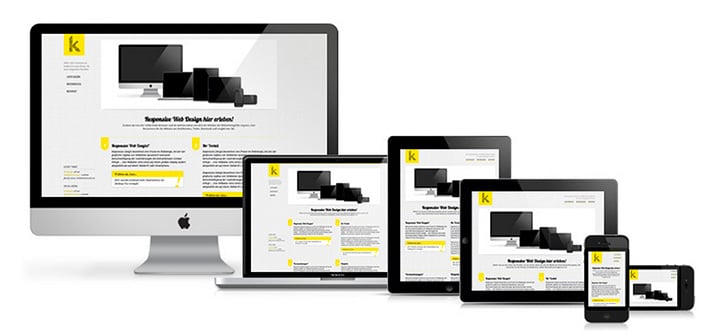
What Is Responsive Web Design?
Web surfers come in all shapes and sizes. And by this I’m talking about screens. You see, we have moved beyond the days of solely designing for desktops. Your potential customer may be browsing through your site on his tablet. Or may find his way to you through his smartphone. He may have his laptop on his legs and do a quick query search.
Whatever the case may be, your website must be ready to respond!
Nowadays, more and more people are using smaller screen devices to view web pages. This is largely in part to the growth of smartphones and other mobile devices such as tablets. If you’re paying close attention to the trends, we may even have to contend with screens on our watches.
However, don’t look upon this as a problem. View it as an opportunity.

The Dilemma
The purpose behind responsive web design is to create one site, but with elements that will react in a different manner independent of the device being used.
For example, when visiting a traditional fixed website on a desktop, it may have content arranged in columns. However, if you attempt to view that same content on a much smaller screen, let’s say a tablet, then you will be forced to scroll through it, which is something that most users find inconvenient. This situation is further complicated by the fact that tablets can be viewed in different ways: portrait or landscape modes.
If we venture onto the same site using a smartphone, well, the issues can increment. For one, the screen is usually smaller, so the website becomes harder to see and comprehend. If your site has large images, it will distort the layout. And if they are graphics heavy, then they will be slow to load and may even break your phone, forcing you to close the browser.
The Solution
By implementing responsive web design, a visitor on his tablet will find that the site will adjust to display content in a different layout, allowing the reader to navigate easily. On a smartphone, this same content may appear in a single column or give the user the ability to swipe through different ones.
With responsive web design, the end goal is for the website to always adjust itself for the most optimal experience no matter the device the customer is using!
It just does; trust me.
I’m kidding.
A responsive web site is based upon fluid grids. On these, all the elements on a page are sized by proportion instead of by pixels. Every element is evaluated in relation to each other. This includes media such as images and video. When the layout changes, the elements can orient themselves to provide an optimal experience.
However, there are some caveats…
Mouse vs touch screen
On a desktop the user has the ability to use a mouse to navigate. On a tablet or smartphone, this is done through the use of touch. Web designers must take this into consideration when creating a responsive web site.
Graphics and Download Speeds
The larger graphic capabilities of desktop sites will be hindered by the less powerful mobile devices. For this reason, a more streamlined design with fewer graphics may be better for smartphones and tablets.
Apps
Creating apps and version for each device and operating platform is a massive challenge. And guess what? It won’t get any easier any time soon. However, the more adaptive your site is, the better off you will be.
Conclusion
Go and take a look at your traffic. I guarantee you’ll be shocked by how much is originated from mobile devices. Unless you’re eager to lose those customers, I’d suggest implementing a responsive web design into your site.
You won’t be disappointed.
As always, comments and questions are welcome. I look forward to hearing from you. Please contact me or shoot me an email.


