Why We Don’t Use Wire framing Anymore: What You Need To Know
Wireframes Simplified
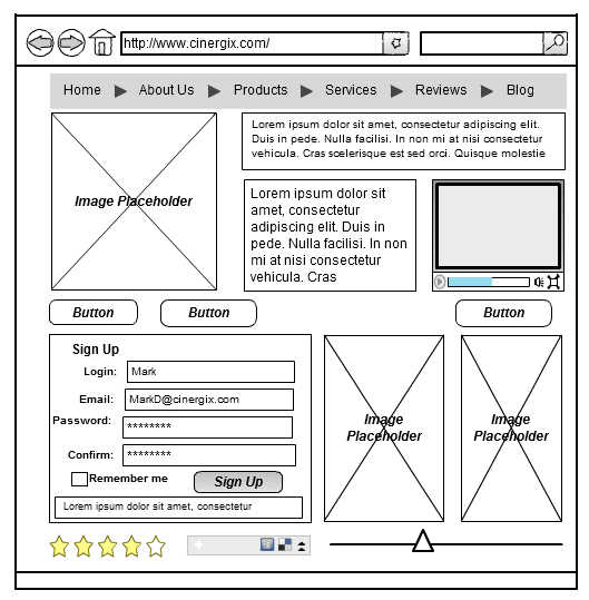
Wireframes are guides that show where the content and navigation elements are going to be located on your specific page. Because of this they differ from site to site, but they all are made of standard elements. These include:
- Breadcrumb
- Search field
- Logo
- Headers, this includes the page title (H1) and the subheads (H2-Hx)
- Share buttons
- Body content
- Contact information
Wireframing Benefits
There are multiple purposes that wireframes serve. These include:
- Help determine the intended functionality of your interface
- Connects the visual design of the site to its information architecture and shows paths between the pages
- Shows ways of displaying specific bits of information on the user interface
- Helps prioritize content and gives and idea of how much space should be provided to a certain item and its placement.
Wireframe Types
Wireframes vary based on the amount of detail that is conveyed and their production. They two main types are:
- Low fidelity wireframes: These are relatively easy to develop and they help project team communication. They are usually more abstract because of the use of simple images to implement mock content and block off space or Latin text as filler for labels and content.
- High fidelity wireframes: There include more detail and are generally usually used for documentation purposes. They usually include information about each item on the page like behavior, dimensions, and more.
To Wireframe or Not to Wireframe, That is the Question
This easy to use prototyping tool sounds good doesn’t it? However, it’s not a tool that our company utilizes anymore. Here’s why:
- No colors: Different shades of gray are used to distinguish items and communicate differences in content
- No images: A sized rectangular box with an “x” through it is used to indicate where images should be placed
- Generic fonts: Typography is not considered important. Instead, the font is resized to indicated headers and changes in the hierarchy of the information on the page.
- Two dimensional: They don’t show interactive features well e.g. hover rates, drop-downs, auto-rotating carousels, or accordions that display show-hide functionality.
Over the last couple of years, we have spent a considerable amount of time brainstorming and improving on our processes in both massive and minimal ways. One of the biggest changes that we’ve made is in the way we approach the assimilation of design and strategy.
The first thing that we do when we begin a design project is strategize various methods to get the job done; both in general and in detail. We cover governance, mental models, personas, digital communication strategy, SEO, content sustainability, advertising opportunities, and other aspects that will help our clients achieve their entrepreneurial dreams.
What we don’t delve into are the detailed recommendations for the user interface and its functionality. In the past, we used wireframes to discuss these topics because they communicate a lot of information i.e. helped to illustrate how big the events and news listings should be, did a good job of displaying content ideas for the main feature, clarified the links that should be in the header or footer, and lots more.
On the other hand, they were also the cause of a many misunderstandings. For example, clients would become used to the exact placement of the calls to action long before designers and, more importantly, users had a chance to provide feedback.
As a creative tool, it was visually underwhelming and caused our client interactions to lean more towards frustrating than exciting. Our meetings should’ve revolved around options for sustainability and content hierarchy, not copywriting or color. Long story short, we found that we had problems that needed to be solved quickly.
Website Design Best Practices
A lot of the thinking that goes into the best practices in interface prototyping is used in industries that are more nimble and who have a shorter sales cycle. For example, when app developers are trying to make certain that they interfaces encourage fast, inexpensive downloads, its makes sense to utilize wireframing tools to test button placements, headline sizes, and other layout-related features.
On the other hand, sites that cater to higher education like (Vox, Amazon, etc.) have hybrid communication goals and lean teams. The reality of this situation forces them to make choices that will meet their disparate goals while simultaneously expressing brand strengths. This challenge is met by creating excellent, well-organized imagery and copy.
The Importance of Content Sustainability
Believe it or not, digital content doesn’t appear out of thin air. When you consider the lean communication resources that are typical of most institutions, it is recommended that new people are brought in. This is because the importance of real content to the success of visual presentations must be stressed and makes it necessary to hire fresh blood; which will help the end product reach its potential in the long term.
Because these clients have to get a lot done with few resources, content sustainability must be the primary goal. The interface is important but, it’s rare for a director to make a fuss over button style or breakpoint. However, when it comes to things like exact packaging for feature stories, the details can be debated for an inordinate amount of time; like weeks or months.
With that being said, our company cares deeply about the functionality and design of our client’s final interface but, we also want to help put them in the best position for their long term success.
In addition, we want our UX designers to grasp the full concept of content. In this way, they will be able to develop interface solutions that are well thought out and that display a realistic, sustainable content hierarchy. It must be stressed that content sustainability is important and should have its own phase that is free of moving elements and boxes.
It is for the reasons stated above that we no longer utilize interface-focused prototype.
This change in our design practices means that our prototypes no longer utilize Latin text for filler. Instead, we find that our design is optimized from the very beginning. When we stopped using placeholder content as a crutch, more attention was paid to the interface of the site; albeit at a later phase in the project. This approach isn’t right for every client base or design firm however, with certain clients, it’s a major improvement.
Get started on your project today.